| 1 | # PostCSS Media Minmax
|
|---|
| 2 |
|
|---|
| 3 | [](https://travis-ci.org/postcss/postcss-media-minmax)
|
|---|
| 4 | [](https://www.npmjs.com/package/postcss-media-minmax)
|
|---|
| 5 | [](https://www.npmjs.com/package/postcss-media-minmax)
|
|---|
| 6 | [](http://opensource.org/licenses/MIT)
|
|---|
| 7 |
|
|---|
| 8 | > 写简单优雅的 Media Queries!
|
|---|
| 9 |
|
|---|
| 10 | Media Queries 中的 `min-width` 和 `max-width` 等属性非常容易混淆,每次看到他们,我都想哭。现在[新的规范](https://drafts.csswg.org/mediaqueries/#mq-range-context)中,可以使用更加直观的 `>=`或`<=` 替代 media queries 中的 min-/max- 前缀。
|
|---|
| 11 |
|
|---|
| 12 | **V2.1.0 开始支持 `>` 或 `<` 符号。**
|
|---|
| 13 |
|
|---|
| 14 | 这是一个实现 [CSS Media Queries Level 4](http://dev.w3.org/csswg/mediaqueries/) Polyfill 的插件,让你现在就可以使用这些特性,妈妈再也不用担心我记不住了,鹅妹子嘤!
|
|---|
| 15 |
|
|---|
| 16 |
|
|---|
| 17 | [English](README.md)
|
|---|
| 18 |
|
|---|
| 19 | -----
|
|---|
| 20 |
|
|---|
| 21 | 
|
|---|
| 22 |
|
|---|
| 23 |
|
|---|
| 24 | ## 安装
|
|---|
| 25 |
|
|---|
| 26 | $ npm install postcss-media-minmax
|
|---|
| 27 |
|
|---|
| 28 | ## 快速开始
|
|---|
| 29 |
|
|---|
| 30 | 示例 1:
|
|---|
| 31 |
|
|---|
| 32 | ```js
|
|---|
| 33 | var fs = require('fs')
|
|---|
| 34 | var postcss = require('postcss')
|
|---|
| 35 | var minmax = require('postcss-media-minmax')
|
|---|
| 36 |
|
|---|
| 37 | var css = fs.readFileSync('input.css', 'utf8')
|
|---|
| 38 |
|
|---|
| 39 | var output = postcss()
|
|---|
| 40 | .use(minmax())
|
|---|
| 41 | .process(css)
|
|---|
| 42 | .css
|
|---|
| 43 |
|
|---|
| 44 | console.log('\n====>Output CSS:\n', output)
|
|---|
| 45 | ```
|
|---|
| 46 |
|
|---|
| 47 | 或者只需:
|
|---|
| 48 |
|
|---|
| 49 | ```js
|
|---|
| 50 | var output = postcss(minmax())
|
|---|
| 51 | .process(css)
|
|---|
| 52 | .css
|
|---|
| 53 | ```
|
|---|
| 54 |
|
|---|
| 55 | input.css:
|
|---|
| 56 |
|
|---|
| 57 | ```css
|
|---|
| 58 | @media screen and (width >= 500px) and (width <= 1200px) {
|
|---|
| 59 | .bar {
|
|---|
| 60 | display: block;
|
|---|
| 61 | }
|
|---|
| 62 | }
|
|---|
| 63 | ```
|
|---|
| 64 |
|
|---|
| 65 | 你将得到:
|
|---|
| 66 |
|
|---|
| 67 | ```css
|
|---|
| 68 | @media screen and (min-width: 500px) and (max-width: 1200px) {
|
|---|
| 69 | .bar {
|
|---|
| 70 | display: block;
|
|---|
| 71 | }
|
|---|
| 72 | }
|
|---|
| 73 | ```
|
|---|
| 74 |
|
|---|
| 75 | ## CSS 语法
|
|---|
| 76 |
|
|---|
| 77 | ### [语法](http://dev.w3.org/csswg/mediaqueries/#mq-syntax)
|
|---|
| 78 |
|
|---|
| 79 | ```
|
|---|
| 80 | <mf-range> = <mf-name> [ '<' | '>' ]? '='? <mf-value>
|
|---|
| 81 | | <mf-value> [ '<' | '>' ]? '='? <mf-name>
|
|---|
| 82 | | <mf-value> '<' '='? <mf-name> '<' '='? <mf-value>
|
|---|
| 83 | | <mf-value> '>' '='? <mf-name> '>' '='? <mf-value>
|
|---|
| 84 | ```
|
|---|
| 85 |
|
|---|
| 86 | 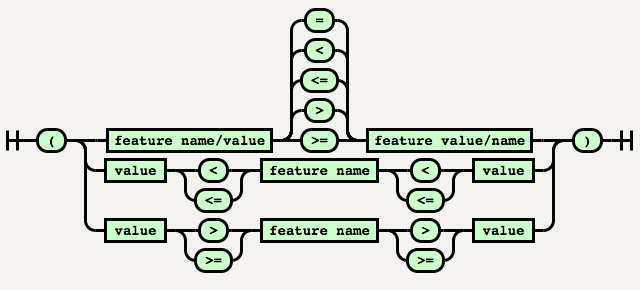
|
|---|
| 87 |
|
|---|
| 88 | PostCSS Media Minmax 目前并没有实现 `200px >= width` 或者 `200px <= width` 这样的语法,因为这样的语法可读性并不不是太好。
|
|---|
| 89 |
|
|---|
| 90 | ## [取值(Values)](http://dev.w3.org/csswg/mediaqueries/#values)
|
|---|
| 91 |
|
|---|
| 92 | **The special values:**
|
|---|
| 93 |
|
|---|
| 94 | * [<ratio>](http://dev.w3.org/csswg/mediaqueries/#typedef-ratio)
|
|---|
| 95 |
|
|---|
| 96 | <ratio> 是一个正(非零非负)的 <integer>(整型)取值,其后跟随0个或多个空白,接着跟随一个斜线(“/”),再跟随0个或多个空白,最后跟随一个正<integer>。
|
|---|
| 97 |
|
|---|
| 98 | ```css
|
|---|
| 99 | @media screen and (device-aspect-ratio: 16 / 9) {
|
|---|
| 100 | /* rules */
|
|---|
| 101 | }
|
|---|
| 102 |
|
|---|
| 103 | /* equivalent to */
|
|---|
| 104 | @media screen and (device-aspect-ratio: 16/9) {
|
|---|
| 105 | /* rules */
|
|---|
| 106 | }
|
|---|
| 107 | ```
|
|---|
| 108 |
|
|---|
| 109 | * [<mq-boolean>](http://dev.w3.org/csswg/mediaqueries/#typedef-mq-boolean)
|
|---|
| 110 |
|
|---|
| 111 | <mq-boolean> 值是一个 0 或 1 的 <integer>(整型)取值。其他任何整数无效。注意, 在 CSS 中 -0 总是等价于 0 的,所以也作为一种有效的 <mq-boolean> 取值。
|
|---|
| 112 |
|
|---|
| 113 | ```css
|
|---|
| 114 | @media screen and (grid: -0) {
|
|---|
| 115 | /* rules */
|
|---|
| 116 | }
|
|---|
| 117 |
|
|---|
| 118 | /* equivalent to */
|
|---|
| 119 | @media screen and (grid: 0) {
|
|---|
| 120 | /* rules */
|
|---|
| 121 | }
|
|---|
| 122 | ```
|
|---|
| 123 |
|
|---|
| 124 | ## 如何使用
|
|---|
| 125 |
|
|---|
| 126 | ### 简写
|
|---|
| 127 |
|
|---|
| 128 | 示例 1中同一个 Media features name 同时存在 `>=` 和 `<=` 时,可以简写为:
|
|---|
| 129 |
|
|---|
| 130 | ```css
|
|---|
| 131 | @media screen and (500px <= width <= 1200px) {
|
|---|
| 132 | .bar {
|
|---|
| 133 | display: block;
|
|---|
| 134 | }
|
|---|
| 135 | }
|
|---|
| 136 | /* 或者 */
|
|---|
| 137 | @media screen and (1200px >= width >= 500px) {
|
|---|
| 138 | .bar {
|
|---|
| 139 | display: block;
|
|---|
| 140 | }
|
|---|
| 141 | }
|
|---|
| 142 | ```
|
|---|
| 143 |
|
|---|
| 144 | 都会得到一样的输出结果:
|
|---|
| 145 |
|
|---|
| 146 | ```css
|
|---|
| 147 | @media screen and (min-width: 500px) and (max-width: 1200px) {
|
|---|
| 148 | .bar {
|
|---|
| 149 | display: block;
|
|---|
| 150 | }
|
|---|
| 151 | }
|
|---|
| 152 | ```
|
|---|
| 153 | **注意**:当 Media features name 在中间的时候,一定要保证两个 `<=` 或 `>=` 的方向一致,否则不会转换。
|
|---|
| 154 |
|
|---|
| 155 | 例如在下面的示例中,width 大于等于 500px 同时又大于等于 1200px,这在语法和逻辑上都是错误的。
|
|---|
| 156 |
|
|---|
| 157 | ```css
|
|---|
| 158 | @media screen and (1200px <= width >= 500px) {
|
|---|
| 159 | .bar {
|
|---|
| 160 | display: block;
|
|---|
| 161 | }
|
|---|
| 162 | }
|
|---|
| 163 | ```
|
|---|
| 164 |
|
|---|
| 165 | ### 支持的 Media features name
|
|---|
| 166 |
|
|---|
| 167 | 规范中目前以下属性支持 min-/max 前缀,PostCSS Media Minmax 全部支持自动转换。
|
|---|
| 168 |
|
|---|
| 169 | * `width`
|
|---|
| 170 | * `height`
|
|---|
| 171 | * `device-width`
|
|---|
| 172 | * `device-height`
|
|---|
| 173 | * `aspect-ratio`
|
|---|
| 174 | * `device-aspect-ratio`
|
|---|
| 175 | * `color`
|
|---|
| 176 | * `color-index`
|
|---|
| 177 | * `monochrome`
|
|---|
| 178 | * `resolution`
|
|---|
| 179 |
|
|---|
| 180 |
|
|---|
| 181 |
|
|---|
| 182 | ### 支持在 `@custom-media` 中使用 & Node Watch
|
|---|
| 183 |
|
|---|
| 184 | ```js
|
|---|
| 185 | var fs = require('fs')
|
|---|
| 186 | var chokidar = require('chokidar')
|
|---|
| 187 | var postcss = require('postcss')
|
|---|
| 188 | var minmax = require('postcss-media-minmax')
|
|---|
| 189 | var customMedia = require('postcss-custom-media')
|
|---|
| 190 |
|
|---|
| 191 | var src = 'input.css'
|
|---|
| 192 |
|
|---|
| 193 | console.info('Watching…\nModify the input.css and save.')
|
|---|
| 194 |
|
|---|
| 195 |
|
|---|
| 196 | chokidar.watch(src, {
|
|---|
| 197 | ignored: /[\/\\]\./,
|
|---|
| 198 | persistent: true
|
|---|
| 199 | }).on('all',
|
|---|
| 200 | function(event, path, stats) {
|
|---|
| 201 | var css = fs.readFileSync(src, 'utf8')
|
|---|
| 202 | var output = postcss()
|
|---|
| 203 | .use(customMedia())
|
|---|
| 204 | .use(minmax())
|
|---|
| 205 | .process(css)
|
|---|
| 206 | .css;
|
|---|
| 207 | fs.writeFileSync('output.css', output)
|
|---|
| 208 | })
|
|---|
| 209 |
|
|---|
| 210 | ```
|
|---|
| 211 |
|
|---|
| 212 |
|
|---|
| 213 | input.css:
|
|---|
| 214 |
|
|---|
| 215 | ```css
|
|---|
| 216 | @custom-media --foo (width >= 20em) and (width <= 50em);
|
|---|
| 217 | @custom-media --bar (height >= 300px) and (height <= 600px);
|
|---|
| 218 |
|
|---|
| 219 | @media (--foo) and (--bar) {
|
|---|
| 220 |
|
|---|
| 221 | }
|
|---|
| 222 | ```
|
|---|
| 223 |
|
|---|
| 224 | output.css:
|
|---|
| 225 |
|
|---|
| 226 | ```css
|
|---|
| 227 | @media (min-width: 20em) and (max-width: 50em) and (min-height: 300px) and (max-height: 600px) {
|
|---|
| 228 |
|
|---|
| 229 | }
|
|---|
| 230 | ```
|
|---|
| 231 |
|
|---|
| 232 | ### Grunt
|
|---|
| 233 |
|
|---|
| 234 | ```js
|
|---|
| 235 | module.exports = function(grunt) {
|
|---|
| 236 | grunt.initConfig({
|
|---|
| 237 | pkg: grunt.file.readJSON('package.json'),
|
|---|
| 238 | postcss: {
|
|---|
| 239 | options: {
|
|---|
| 240 | processors: [
|
|---|
| 241 | require('autoprefixer-core')({ browsers: ['> 0%'] }).postcss, //Other plugin
|
|---|
| 242 | require('postcss-media-minmax')(),
|
|---|
| 243 | ]
|
|---|
| 244 | },
|
|---|
| 245 | dist: {
|
|---|
| 246 | src: ['src/*.css'],
|
|---|
| 247 | dest: 'build/grunt.css'
|
|---|
| 248 | }
|
|---|
| 249 | }
|
|---|
| 250 | });
|
|---|
| 251 |
|
|---|
| 252 | grunt.loadNpmTasks('grunt-contrib-uglify');
|
|---|
| 253 | grunt.loadNpmTasks('grunt-postcss');
|
|---|
| 254 |
|
|---|
| 255 | grunt.registerTask('default', ['postcss']);
|
|---|
| 256 | }
|
|---|
| 257 | ```
|
|---|
| 258 |
|
|---|
| 259 | ### Gulp
|
|---|
| 260 |
|
|---|
| 261 | ```js
|
|---|
| 262 | var gulp = require('gulp');
|
|---|
| 263 | var rename = require('gulp-rename');
|
|---|
| 264 | var postcss = require('gulp-postcss');
|
|---|
| 265 | var selector = require('postcss-media-minmax')
|
|---|
| 266 | var autoprefixer = require('autoprefixer-core')
|
|---|
| 267 |
|
|---|
| 268 | gulp.task('default', function () {
|
|---|
| 269 | var processors = [
|
|---|
| 270 | autoprefixer({ browsers: ['> 0%'] }), //Other plugin
|
|---|
| 271 | minmax()
|
|---|
| 272 | ];
|
|---|
| 273 | gulp.src('src/*.css')
|
|---|
| 274 | .pipe(postcss(processors))
|
|---|
| 275 | .pipe(rename('gulp.css'))
|
|---|
| 276 | .pipe(gulp.dest('build'))
|
|---|
| 277 | });
|
|---|
| 278 | gulp.watch('src/*.css', ['default']);
|
|---|
| 279 | ```
|
|---|
| 280 |
|
|---|
| 281 |
|
|---|
| 282 | ## 贡献
|
|---|
| 283 |
|
|---|
| 284 | * 安装相关的依赖模块。
|
|---|
| 285 | * 尊重编码风格(安装 [EditorConfig](http://editorconfig.org/))。
|
|---|
| 286 | * 在[test](test)目录添加测试用例。
|
|---|
| 287 | * 运行测试。
|
|---|
| 288 |
|
|---|
| 289 | ```
|
|---|
| 290 | $ git clone https://github.com/postcss/postcss-media-minmaxs.git
|
|---|
| 291 | $ git checkout -b patch
|
|---|
| 292 | $ npm install
|
|---|
| 293 | $ npm test
|
|---|
| 294 | ```
|
|---|
| 295 |
|
|---|
| 296 | ## 致谢
|
|---|
| 297 |
|
|---|
| 298 | * 感谢 PostCSS 作者 [Andrey Sitnik](https://github.com/ai),带给我们如此简单易用的 CSS 语法解析工具。
|
|---|
| 299 | * 感谢 [Tab Atkins Jr.](http://xanthir.com/contact/) 辛苦编写了 Media Queries Level 4 规范。
|
|---|
| 300 | * 感谢 [@紫云飞](http://weibo.com/p/1005051708684567) 对本插件的建议和帮助。
|
|---|
| 301 |
|
|---|
| 302 | ## [Changelog](CHANGELOG.md)
|
|---|
| 303 |
|
|---|
| 304 | ## [License](LICENSE)
|
|---|