| 1 | # PostCSS Media Minmax
|
|---|
| 2 |
|
|---|
| 3 | [](https://cssdb.org/#media-query-ranges)
|
|---|
| 4 | [](https://travis-ci.org/postcss/postcss-media-minmax)
|
|---|
| 5 | [](https://www.npmjs.com/package/postcss-media-minmax)
|
|---|
| 6 | [](https://www.npmjs.com/package/postcss-media-minmax)
|
|---|
| 7 | [](https://opensource.org/licenses/MIT)
|
|---|
| 8 |
|
|---|
| 9 | > Writing simple and graceful media queries!
|
|---|
| 10 |
|
|---|
| 11 | The `min-width`, `max-width` and many other properties of media queries are really confusing. I want to cry every time I see them. But right now according to the new specs, you can use more intuitive `<=` or `>=` to replace the `min-`/`max-` prefixes in media queries.
|
|---|
| 12 |
|
|---|
| 13 | V2.1.0 began to support `>` or `<` symbol.
|
|---|
| 14 |
|
|---|
| 15 | This is a polyfill plugin which supports [CSS Media Queries Level 4](https://drafts.csswg.org/mediaqueries/#mq-range-context) and gives you access to the new features right away. Mom will never worry about my study any more. So amazing!
|
|---|
| 16 |
|
|---|
| 17 |
|
|---|
| 18 | [简体中文](README-zh.md)
|
|---|
| 19 |
|
|---|
| 20 | -----
|
|---|
| 21 |
|
|---|
| 22 | 
|
|---|
| 23 |
|
|---|
| 24 |
|
|---|
| 25 | ## Installation
|
|---|
| 26 |
|
|---|
| 27 | $ npm install postcss-media-minmax
|
|---|
| 28 |
|
|---|
| 29 | ## Quick Start
|
|---|
| 30 |
|
|---|
| 31 | Example 1:
|
|---|
| 32 |
|
|---|
| 33 | ```js
|
|---|
| 34 | var fs = require('fs')
|
|---|
| 35 | var postcss = require('postcss')
|
|---|
| 36 | var minmax = require('postcss-media-minmax')
|
|---|
| 37 |
|
|---|
| 38 | var css = fs.readFileSync('input.css', 'utf8')
|
|---|
| 39 |
|
|---|
| 40 | var output = postcss()
|
|---|
| 41 | .use(minmax())
|
|---|
| 42 | .process(css)
|
|---|
| 43 | .css
|
|---|
| 44 |
|
|---|
| 45 | console.log('\n====>Output CSS:\n', output)
|
|---|
| 46 | ```
|
|---|
| 47 |
|
|---|
| 48 | Or just:
|
|---|
| 49 |
|
|---|
| 50 | ```js
|
|---|
| 51 | var output = postcss(minmax())
|
|---|
| 52 | .process(css)
|
|---|
| 53 | .css
|
|---|
| 54 | ```
|
|---|
| 55 |
|
|---|
| 56 | input.css:
|
|---|
| 57 |
|
|---|
| 58 | ```css
|
|---|
| 59 | @media screen and (width >= 500px) and (width <= 1200px) {
|
|---|
| 60 | .bar {
|
|---|
| 61 | display: block;
|
|---|
| 62 | }
|
|---|
| 63 | }
|
|---|
| 64 | ```
|
|---|
| 65 |
|
|---|
| 66 | You will get:
|
|---|
| 67 |
|
|---|
| 68 | ```css
|
|---|
| 69 | @media screen and (min-width: 500px) and (max-width: 1200px) {
|
|---|
| 70 | .bar {
|
|---|
| 71 | display: block;
|
|---|
| 72 | }
|
|---|
| 73 | }
|
|---|
| 74 | ```
|
|---|
| 75 |
|
|---|
| 76 | ## CSS syntax
|
|---|
| 77 |
|
|---|
| 78 | ### [Syntax](https://drafts.csswg.org/mediaqueries/#mq-range-context)
|
|---|
| 79 |
|
|---|
| 80 | ```
|
|---|
| 81 | <mf-range> = <mf-name> [ '<' | '>' ]? '='? <mf-value>
|
|---|
| 82 | | <mf-value> [ '<' | '>' ]? '='? <mf-name>
|
|---|
| 83 | | <mf-value> '<' '='? <mf-name> '<' '='? <mf-value>
|
|---|
| 84 | | <mf-value> '>' '='? <mf-name> '>' '='? <mf-value>
|
|---|
| 85 | ```
|
|---|
| 86 |
|
|---|
| 87 | 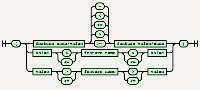
|
|---|
| 88 |
|
|---|
| 89 | PostCSS Media Minmax hasn't implemented syntax such as `200px > = width` or `200px < = width` currently because its readability is not good enough yet.
|
|---|
| 90 |
|
|---|
| 91 | ## [Values](https://drafts.csswg.org/mediaqueries/#values)
|
|---|
| 92 |
|
|---|
| 93 | **The special values:**
|
|---|
| 94 |
|
|---|
| 95 | * [<ratio>](https://drafts.csswg.org/mediaqueries/#typedef-ratio)
|
|---|
| 96 |
|
|---|
| 97 | The <ratio> value type is a positive (not zero or negative) <integer> followed by optional whitespace, followed by a solidus ('/'), followed by optional whitespace, followed by a positive <integer>. <ratio>s can be ordered or compared by transforming them into the number obtained by dividing their first <integer> by their second <integer>.
|
|---|
| 98 |
|
|---|
| 99 | ```css
|
|---|
| 100 | @media screen and (device-aspect-ratio: 16 / 9) {
|
|---|
| 101 | /* rules */
|
|---|
| 102 | }
|
|---|
| 103 |
|
|---|
| 104 | /* equivalent to */
|
|---|
| 105 | @media screen and (device-aspect-ratio: 16/9) {
|
|---|
| 106 | /* rules */
|
|---|
| 107 | }
|
|---|
| 108 | ```
|
|---|
| 109 |
|
|---|
| 110 | * [<mq-boolean>](https://drafts.csswg.org/mediaqueries/#typedef-mq-boolean)
|
|---|
| 111 |
|
|---|
| 112 | The <mq-boolean> value type is an <integer> with the value 0 or 1. Any other integer value is invalid. Note that -0 is always equivalent to 0 in CSS, and so is also accepted as a valid <mq-boolean> value.
|
|---|
| 113 |
|
|---|
| 114 | ```css
|
|---|
| 115 | @media screen and (grid: -0) {
|
|---|
| 116 | /* rules */
|
|---|
| 117 | }
|
|---|
| 118 |
|
|---|
| 119 | /* equivalent to */
|
|---|
| 120 | @media screen and (grid: 0) {
|
|---|
| 121 | /* rules */
|
|---|
| 122 | }
|
|---|
| 123 | ```
|
|---|
| 124 |
|
|---|
| 125 | ## How to use
|
|---|
| 126 |
|
|---|
| 127 | ### Shorthand
|
|---|
| 128 |
|
|---|
| 129 | In Example 1, if a feature has both `>=` and `<=` logic, it can be written as follows:
|
|---|
| 130 |
|
|---|
| 131 | ```css
|
|---|
| 132 | @media screen and (500px <= width <= 1200px) {
|
|---|
| 133 | .bar {
|
|---|
| 134 | display: block;
|
|---|
| 135 | }
|
|---|
| 136 | }
|
|---|
| 137 | /* Or */
|
|---|
| 138 | @media screen and (1200px >= width >= 500px) {
|
|---|
| 139 | .bar {
|
|---|
| 140 | display: block;
|
|---|
| 141 | }
|
|---|
| 142 | }
|
|---|
| 143 | ```
|
|---|
| 144 |
|
|---|
| 145 | Which will output:
|
|---|
| 146 |
|
|---|
| 147 | ```css
|
|---|
| 148 | @media screen and (min-width: 500px) and (max-width: 1200px) {
|
|---|
| 149 | .bar {
|
|---|
| 150 | display: block;
|
|---|
| 151 | }
|
|---|
| 152 | }
|
|---|
| 153 | ```
|
|---|
| 154 |
|
|---|
| 155 | **Note**: When the media feature name is in the middle, we must ensure that two `<=` or `>=` are in the same direction, otherwise which will not be converted.
|
|---|
| 156 |
|
|---|
| 157 | E.g. in the example below, `width` is greater than or equal to 500px and is greater than or equal to 1200px, which is the wrong in both grammar and logic.
|
|---|
| 158 |
|
|---|
| 159 |
|
|---|
| 160 | ```css
|
|---|
| 161 | @media screen and (1200px <= width >= 500px) {
|
|---|
| 162 | .bar {
|
|---|
| 163 | display: block;
|
|---|
| 164 | }
|
|---|
| 165 | }
|
|---|
| 166 | ```
|
|---|
| 167 |
|
|---|
| 168 | ### Media feature names
|
|---|
| 169 |
|
|---|
| 170 | The following properties support the `min-`/`max-` prefixes in the specifications at present, and will be automatically converted by PostCSS Media Minmax.
|
|---|
| 171 |
|
|---|
| 172 | * `width`
|
|---|
| 173 | * `height`
|
|---|
| 174 | * `device-width`
|
|---|
| 175 | * `device-height`
|
|---|
| 176 | * `aspect-ratio`
|
|---|
| 177 | * `device-aspect-ratio`
|
|---|
| 178 | * `color`
|
|---|
| 179 | * `color-index`
|
|---|
| 180 | * `monochrome`
|
|---|
| 181 | * `resolution`
|
|---|
| 182 |
|
|---|
| 183 |
|
|---|
| 184 |
|
|---|
| 185 | ### Using with `@custom-media` & Node Watch
|
|---|
| 186 |
|
|---|
| 187 | ```js
|
|---|
| 188 | var fs = require('fs')
|
|---|
| 189 | var chokidar = require('chokidar')
|
|---|
| 190 | var postcss = require('postcss')
|
|---|
| 191 | var minmax = require('postcss-media-minmax')
|
|---|
| 192 | var customMedia = require('postcss-custom-media')
|
|---|
| 193 |
|
|---|
| 194 | var src = 'input.css'
|
|---|
| 195 |
|
|---|
| 196 | console.info('Watching…\nModify the input.css and save.')
|
|---|
| 197 |
|
|---|
| 198 |
|
|---|
| 199 | chokidar.watch(src, {
|
|---|
| 200 | ignored: /[\/\\]\./,
|
|---|
| 201 | persistent: true
|
|---|
| 202 | }).on('all',
|
|---|
| 203 | function(event, path, stats) {
|
|---|
| 204 | var css = fs.readFileSync(src, 'utf8')
|
|---|
| 205 | var output = postcss()
|
|---|
| 206 | .use(customMedia())
|
|---|
| 207 | .use(minmax())
|
|---|
| 208 | .process(css)
|
|---|
| 209 | .css;
|
|---|
| 210 | fs.writeFileSync('output.css', output)
|
|---|
| 211 | })
|
|---|
| 212 |
|
|---|
| 213 | ```
|
|---|
| 214 |
|
|---|
| 215 |
|
|---|
| 216 | input.css:
|
|---|
| 217 |
|
|---|
| 218 | ```css
|
|---|
| 219 | @custom-media --foo (width >= 20em) and (width <= 50em);
|
|---|
| 220 | @custom-media --bar (height >= 300px) and (height <= 600px);
|
|---|
| 221 |
|
|---|
| 222 | @media (--foo) and (--bar) {
|
|---|
| 223 |
|
|---|
| 224 | }
|
|---|
| 225 | ```
|
|---|
| 226 |
|
|---|
| 227 | output.css:
|
|---|
| 228 |
|
|---|
| 229 | ```css
|
|---|
| 230 | @media (min-width: 20em) and (max-width: 50em) and (min-height: 300px) and (max-height: 600px) {
|
|---|
| 231 |
|
|---|
| 232 | }
|
|---|
| 233 | ```
|
|---|
| 234 |
|
|---|
| 235 | ### Grunt
|
|---|
| 236 |
|
|---|
| 237 | ```js
|
|---|
| 238 | module.exports = function(grunt) {
|
|---|
| 239 | grunt.initConfig({
|
|---|
| 240 | pkg: grunt.file.readJSON('package.json'),
|
|---|
| 241 | postcss: {
|
|---|
| 242 | options: {
|
|---|
| 243 | processors: [
|
|---|
| 244 | require('autoprefixer-core')({ browsers: ['> 0%'] }).postcss, //Other plugin
|
|---|
| 245 | require('postcss-media-minmax')(),
|
|---|
| 246 | ]
|
|---|
| 247 | },
|
|---|
| 248 | dist: {
|
|---|
| 249 | src: ['src/*.css'],
|
|---|
| 250 | dest: 'build/grunt.css'
|
|---|
| 251 | }
|
|---|
| 252 | }
|
|---|
| 253 | });
|
|---|
| 254 |
|
|---|
| 255 | grunt.loadNpmTasks('grunt-contrib-uglify');
|
|---|
| 256 | grunt.loadNpmTasks('grunt-postcss');
|
|---|
| 257 |
|
|---|
| 258 | grunt.registerTask('default', ['postcss']);
|
|---|
| 259 | }
|
|---|
| 260 | ```
|
|---|
| 261 |
|
|---|
| 262 | ### Gulp
|
|---|
| 263 |
|
|---|
| 264 | ```js
|
|---|
| 265 | var gulp = require('gulp');
|
|---|
| 266 | var rename = require('gulp-rename');
|
|---|
| 267 | var postcss = require('gulp-postcss');
|
|---|
| 268 | var selector = require('postcss-media-minmax')
|
|---|
| 269 | var autoprefixer = require('autoprefixer-core')
|
|---|
| 270 |
|
|---|
| 271 | gulp.task('default', function () {
|
|---|
| 272 | var processors = [
|
|---|
| 273 | autoprefixer({ browsers: ['> 0%'] }), //Other plugin
|
|---|
| 274 | minmax()
|
|---|
| 275 | ];
|
|---|
| 276 | gulp.src('src/*.css')
|
|---|
| 277 | .pipe(postcss(processors))
|
|---|
| 278 | .pipe(rename('gulp.css'))
|
|---|
| 279 | .pipe(gulp.dest('build'))
|
|---|
| 280 | });
|
|---|
| 281 | gulp.watch('src/*.css', ['default']);
|
|---|
| 282 | ```
|
|---|
| 283 |
|
|---|
| 284 |
|
|---|
| 285 | ## Contributing
|
|---|
| 286 |
|
|---|
| 287 | * Install all the dependent modules.
|
|---|
| 288 | * Respect the coding style (Use [EditorConfig](https://editorconfig.org/)).
|
|---|
| 289 | * Add test cases in the [test](test) directory.
|
|---|
| 290 | * Run the test cases.
|
|---|
| 291 |
|
|---|
| 292 | ```
|
|---|
| 293 | $ git clone https://github.com/postcss/postcss-media-minmaxs.git
|
|---|
| 294 | $ git checkout -b patch
|
|---|
| 295 | $ npm install
|
|---|
| 296 | $ npm test
|
|---|
| 297 | ```
|
|---|
| 298 |
|
|---|
| 299 | ## Acknowledgements
|
|---|
| 300 |
|
|---|
| 301 | * Thank the author of PostCSS [Andrey Sitnik](https://github.com/ai) for giving us such simple and easy CSS syntax analysis tools.
|
|---|
| 302 |
|
|---|
| 303 | * Thank [Tab Atkins Jr.](https://www.xanthir.com/contact/) for writing the specs of Media Queries Level 4.
|
|---|
| 304 |
|
|---|
| 305 | * Thank [ziyunfei](https://weibo.com/p/1005051708684567) for suggestions and help of this plugin.
|
|---|
| 306 |
|
|---|
| 307 |
|
|---|
| 308 | ## [Changelog](CHANGELOG.md)
|
|---|
| 309 |
|
|---|
| 310 | ## [License](LICENSE)
|
|---|